Homepage
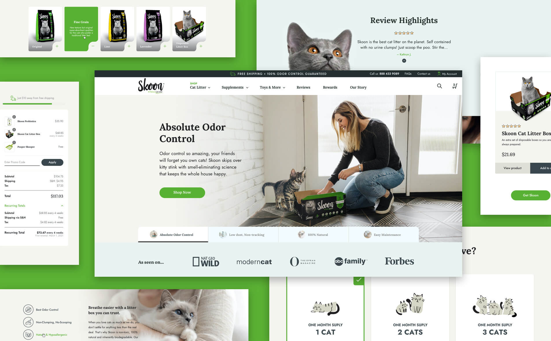
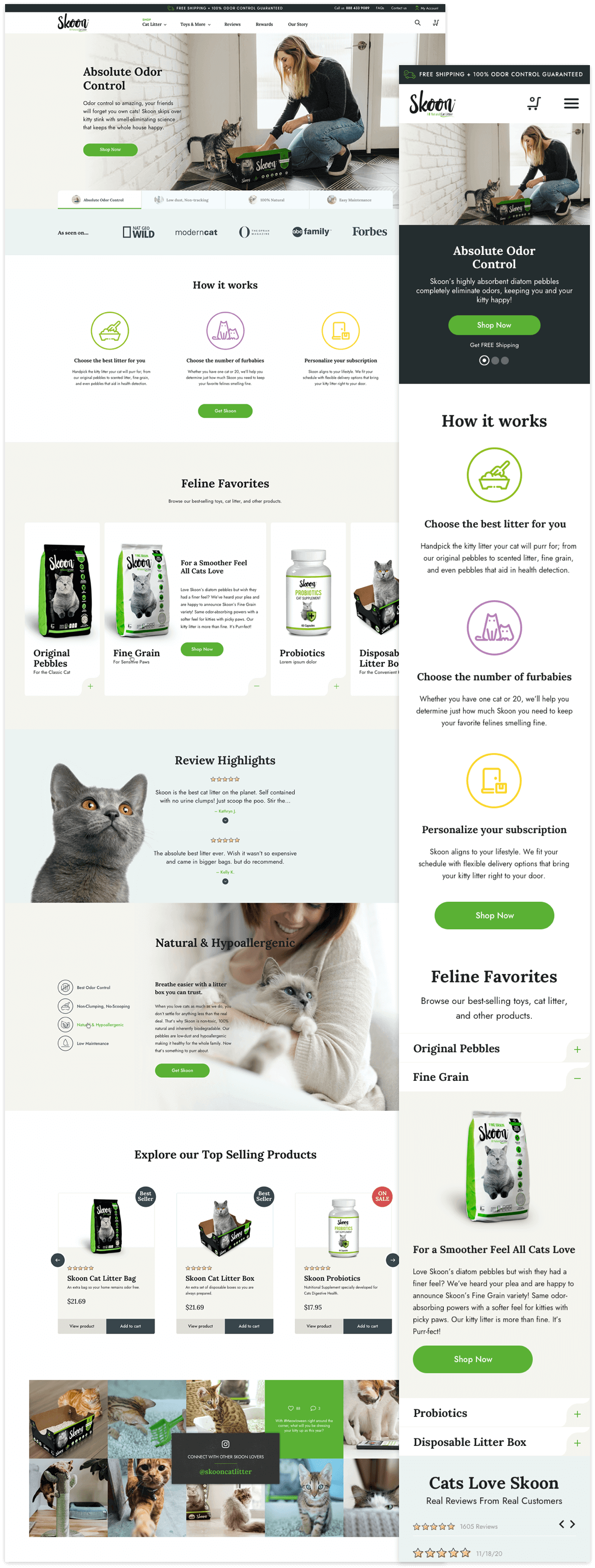
One of the biggest changes we implemented was to refresh the user interface, making navigation between the sections of the website more user-friendly and including simple and eye-catching calls to action. From the home page, users can now visit the store, view the latest buyers’ reviews, and get quick access to product descriptions by simply displaying a tab.
Purchase step by step
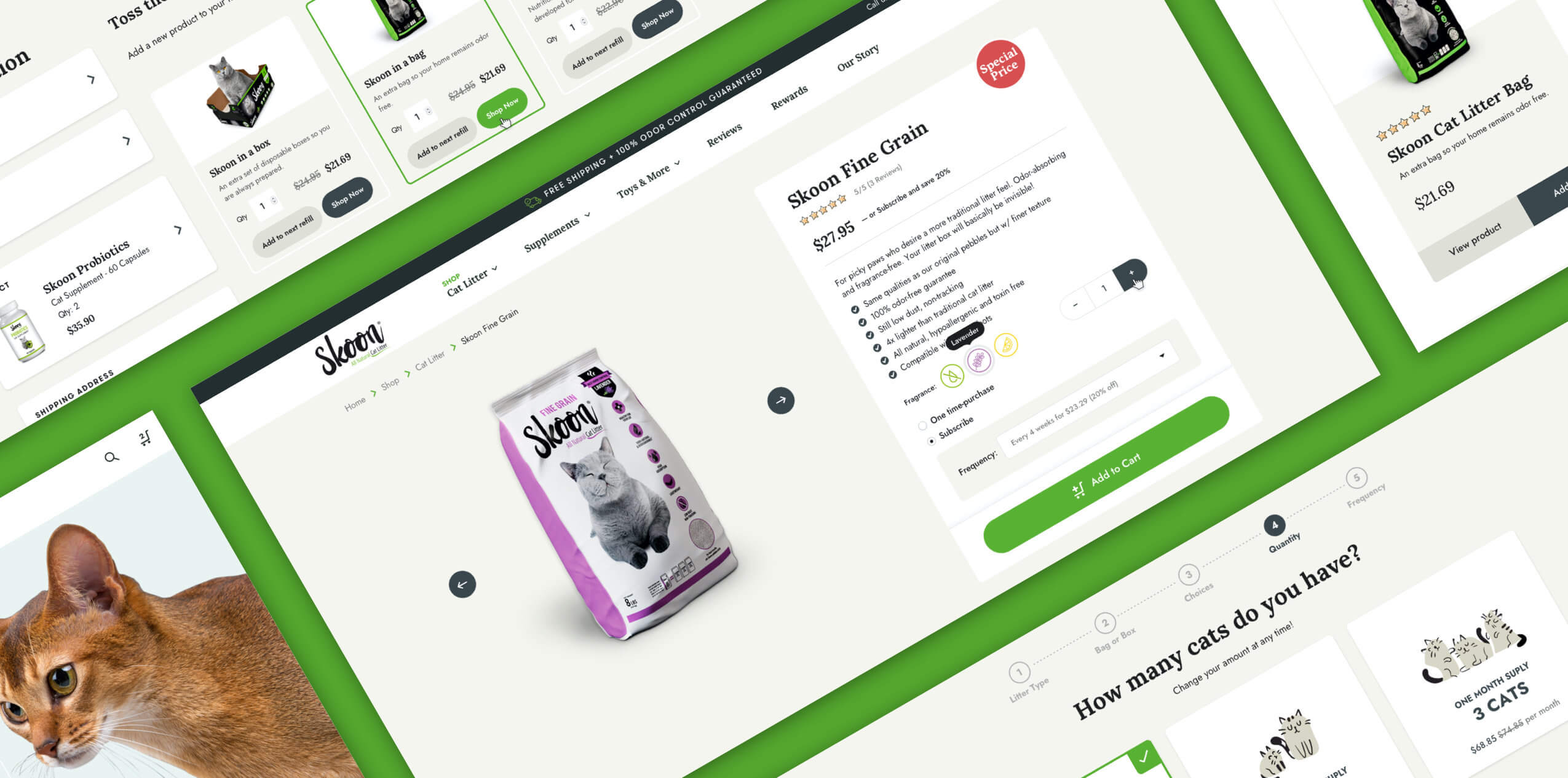
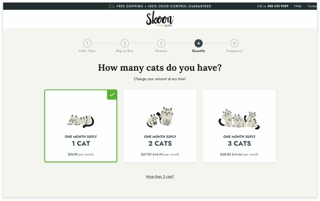
Another great added component is the step-by-step purchasing flow, which makes it easy to choose products according to customer needs. Through a simple selection method, users can choose the type of sand, its size, presentation and quantity. The information provided allows the e-commerce platform to determine the purchase frequency and suggest new offers.
Mini Cart
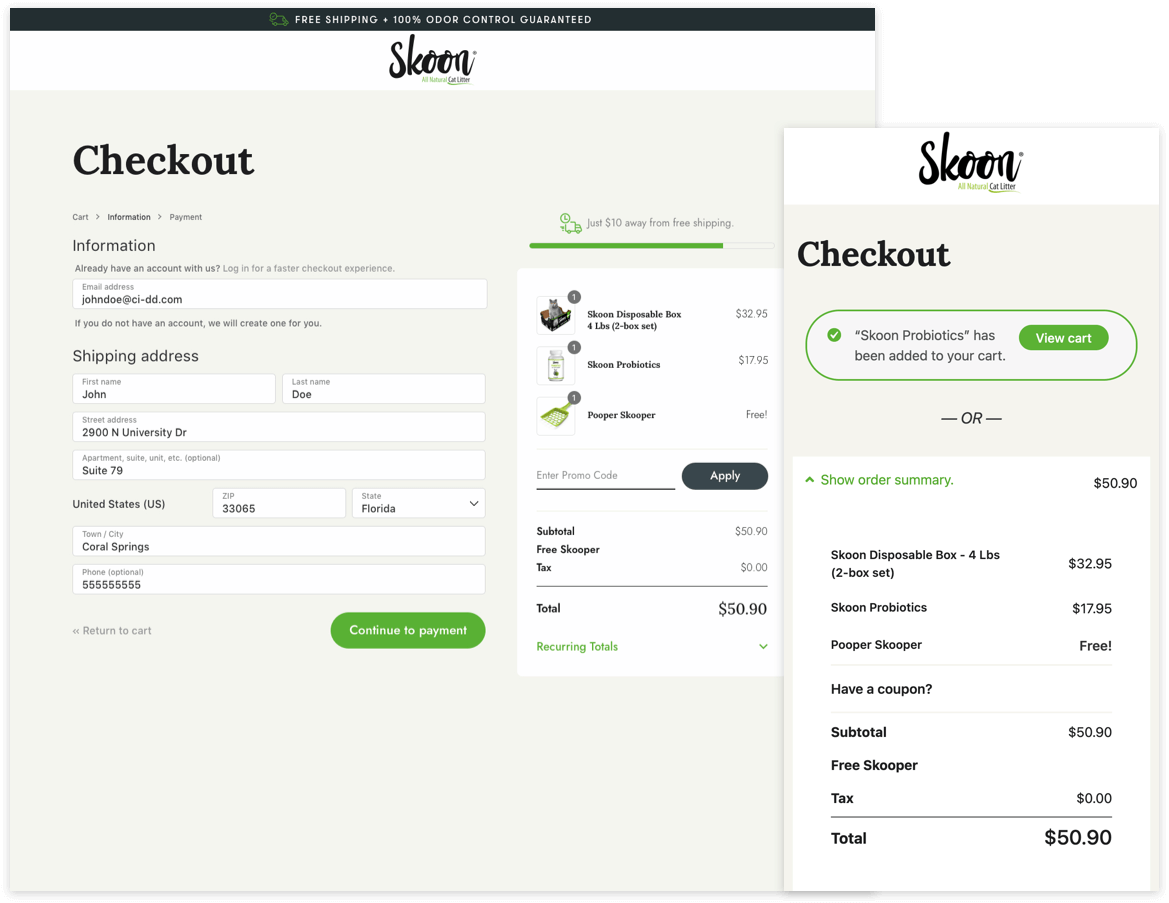
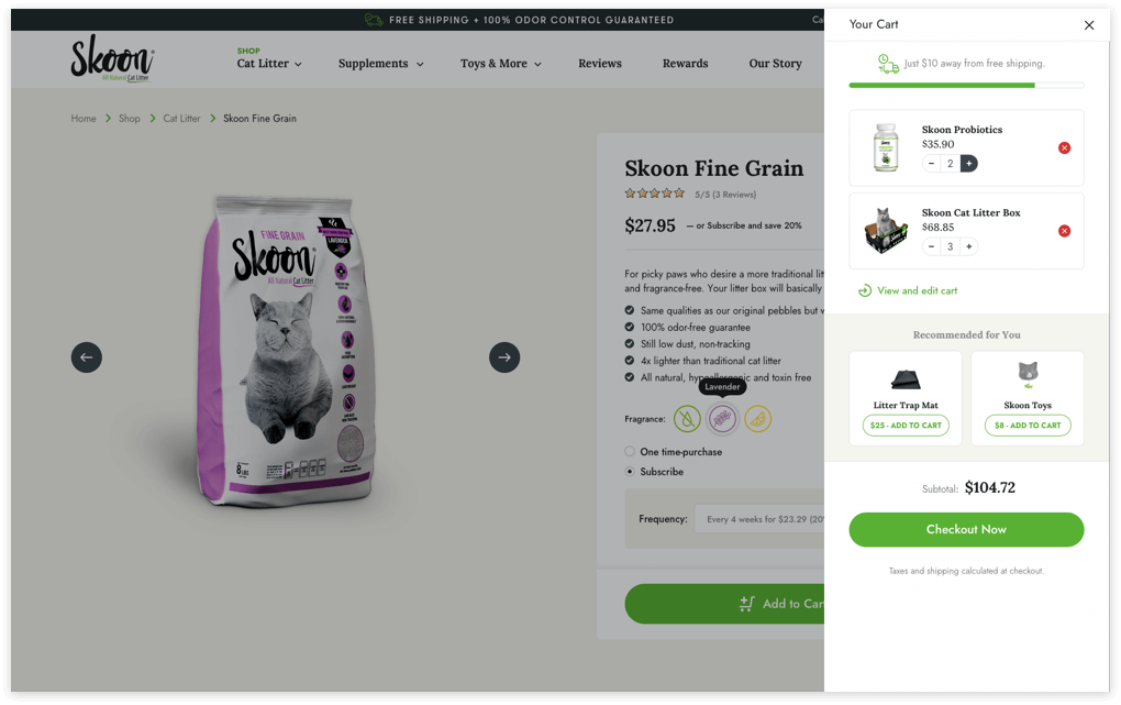
Part of our mission was to simplify the shopping experience. We achieve this by adding a Mini Cart in the form of a sliding sidebar that shows the number of products added and the accumulated amount; in this way, users have at hand a quick count of their purchases so far.
This feature also provided a easy way to present UpSell options to customers who can view related products to be included in their purchase.
Subscription
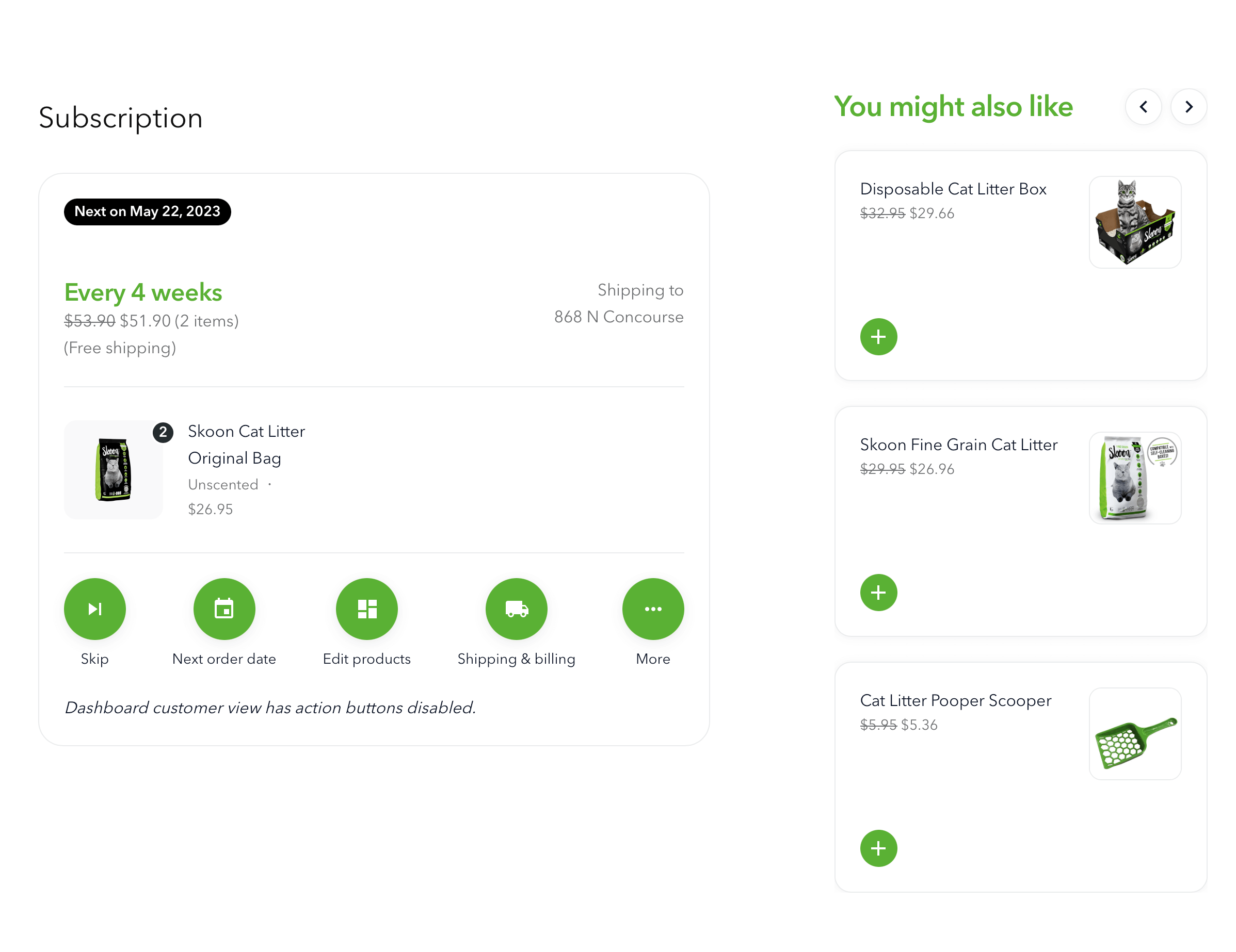
Seeking to create a lasting relationship between the company and customers, we worked together with SKIO Subscriptions program whose main characteristics are their innovative workflows (build-a-box, volumen discounts, and sample trials) and impeccable managing interface. By registering, users not only have the opportunity to take advantage of new offers, but also to view order history, schedule or modify their deliveries, change the shipping address, and add products to their next renewals.
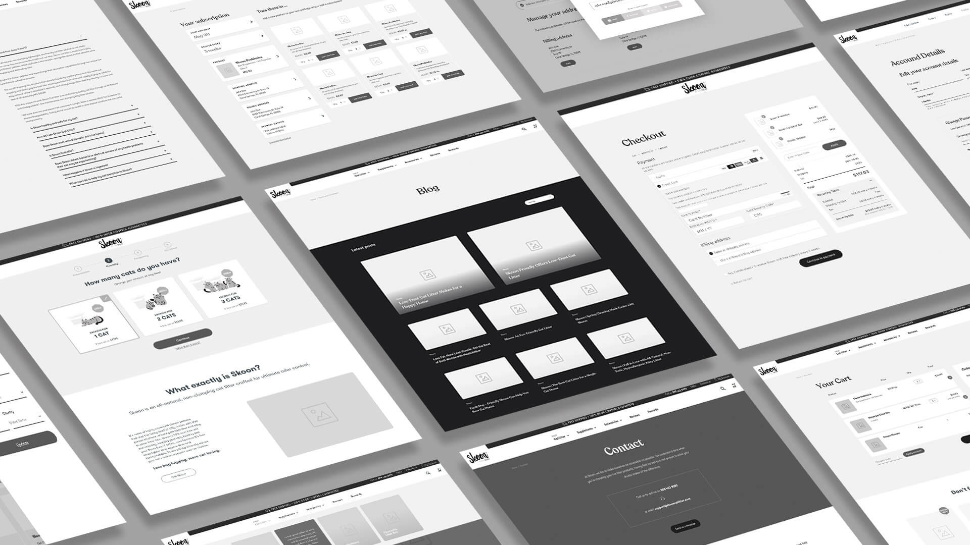
The intuitive graphic interfase makes it possible to browse panels with options for changes to subscription.

Another great added component is the step-by-step purchasing flow, which makes it easy to choose products according to customer needs. Through a simple selection method, users can choose the type of sand, its size, presentation and quantity. The information provided allows the e-commerce platform to determine the purchase frequency and suggest new offers.
Part of our mission was to simplify the shopping experience. We achieve this by adding a Mini Cart in the form of a sliding sidebar that shows the number of products added and the accumulated amount; in this way, users have at hand a quick count of their purchases so far.
This feature also provided a easy way to present UpSell options to customers who can view related products to be included in their purchase.

Seeking to create a lasting relationship between the company and customers, we worked together with SKIO Subscriptions program whose main characteristics are their innovative workflows (build-a-box, volumen discounts, and sample trials) and impeccable managing interface. By registering, users not only have the opportunity to take advantage of new offers, but also to view order history, schedule or modify their deliveries, change the shipping address, and add products to their next renewals.
The intuitive graphic interfase makes it possible to browse panels with options for changes to subscription.
