Homepage
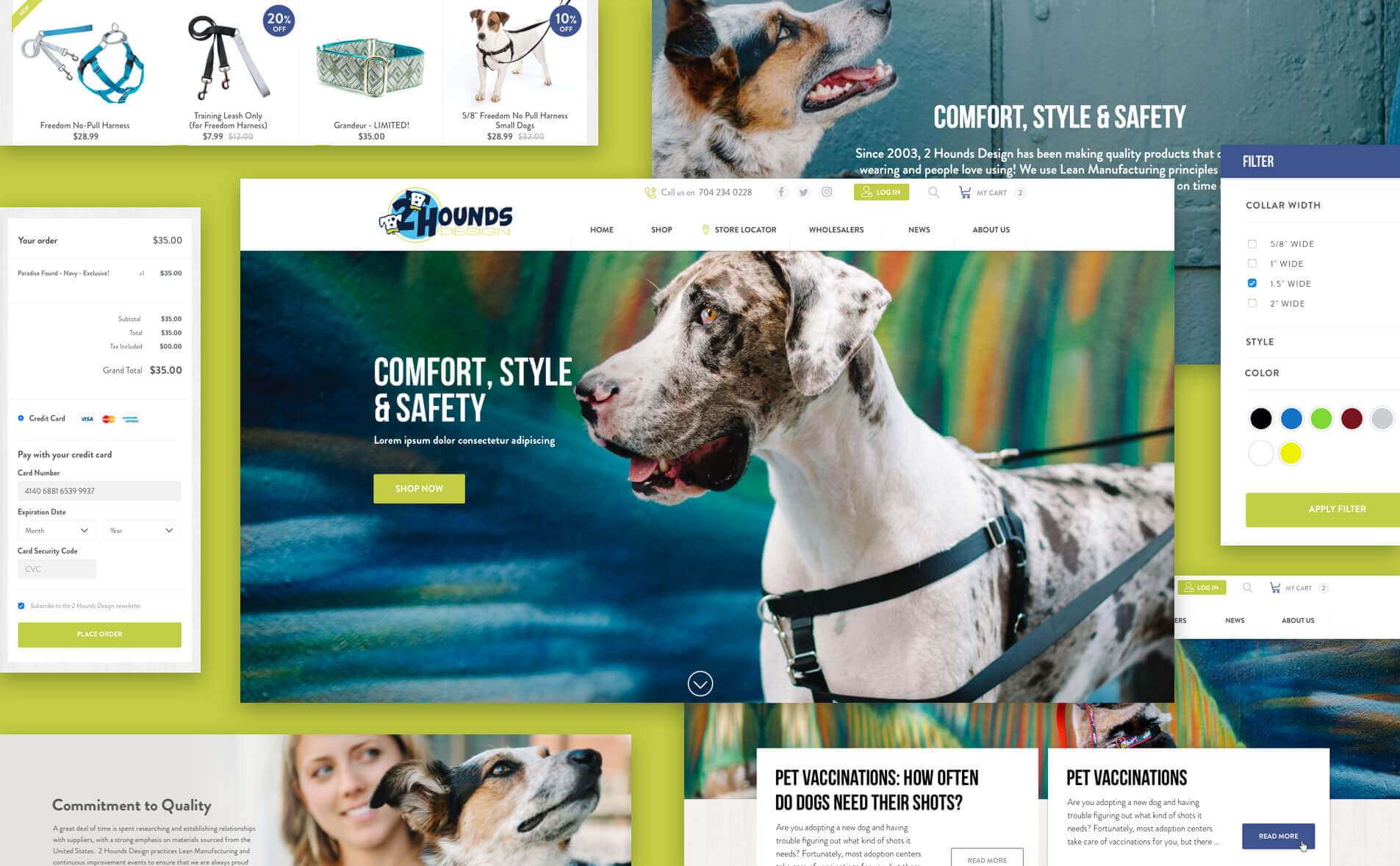
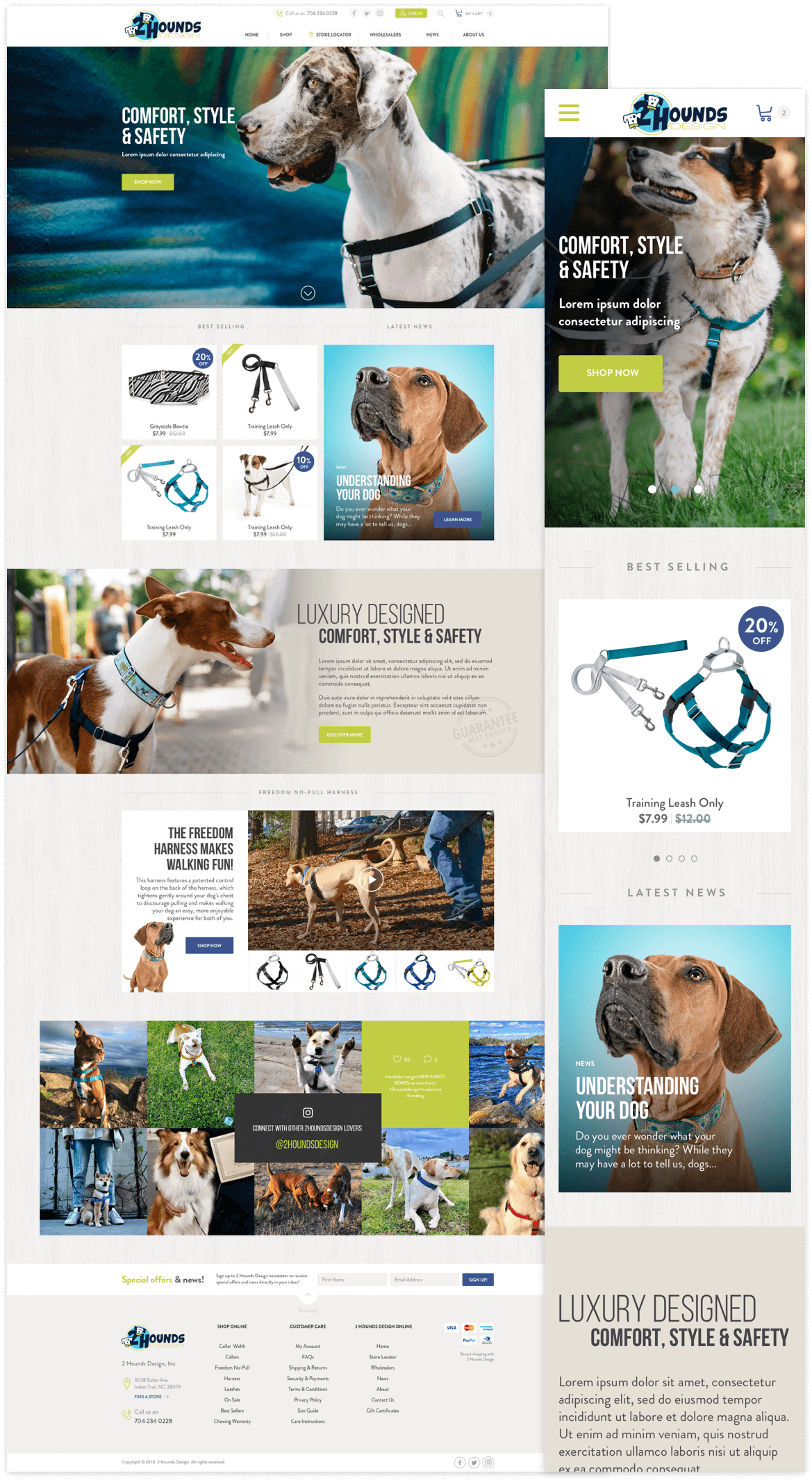
Our team knew the importance of creating an eye-catching and friendly home page. For this reason, we include certain elements to validate the trajectory and the service offered by the company. From the moment they enter, users can access the store by pressing the “Shop Now” button or explore the categories that show specific items.
We also integrated a banner with a video, which exposes the operation of its flagship product, and a sample of its Instagram feed to encourage users to join the community.
Shop
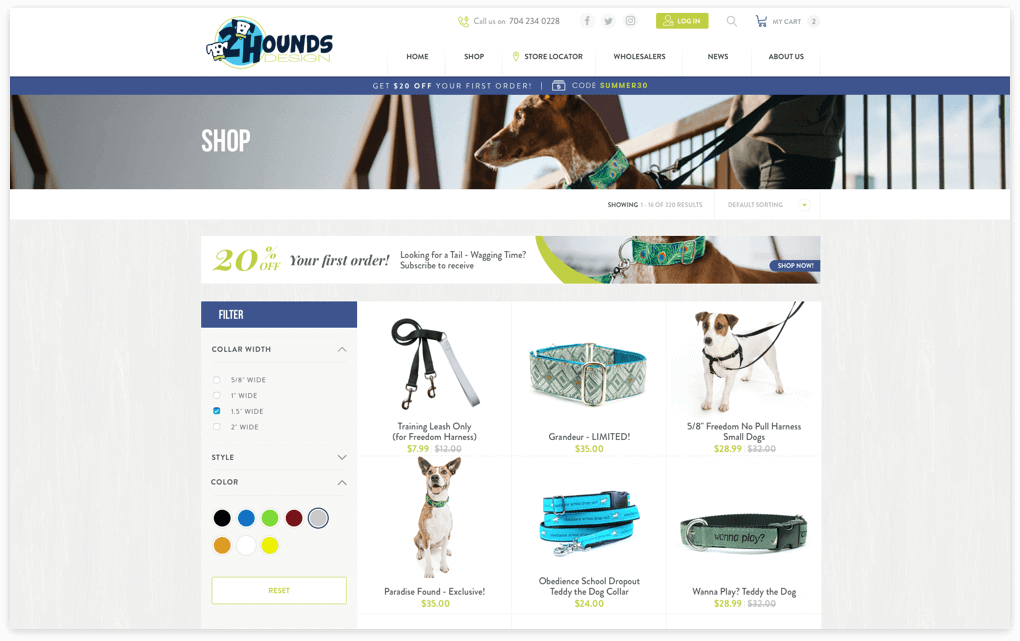
By redesigning the store, we made it easier for customers to navigate while adding items to the cart. The filter columns and the tab to sort the search results, allow to reach specific products in less time, thus simplifying the choice of characteristics in a collar or harness.
Products
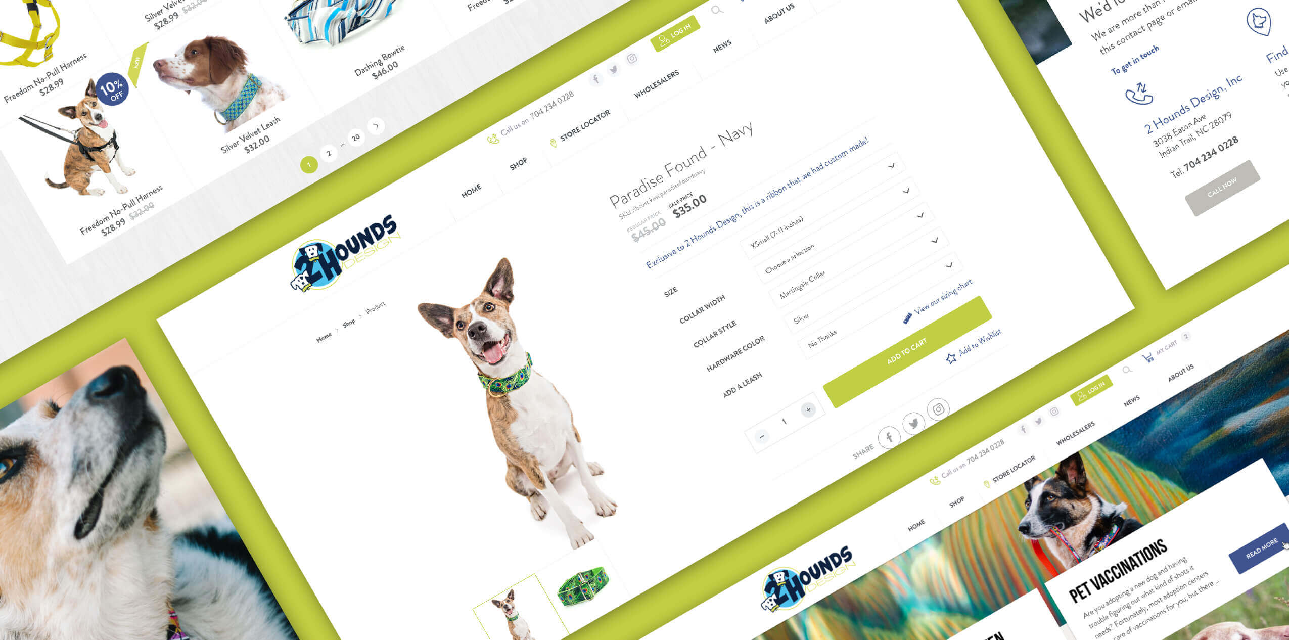
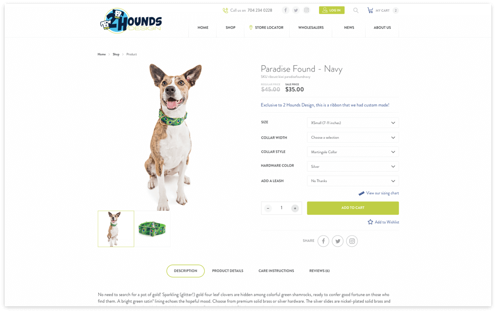
With detailed descriptions and clear images that zoom in on the slide, we get a perfect product page to show the detail of all the items. Users who want to access the reviews or know the instructions for use, can do so by pressing any of the buttons below.
Additionally, you will find customization options for your purchase by choosing the size of the harness and the complementary product suggested by the system.
Wholesalers
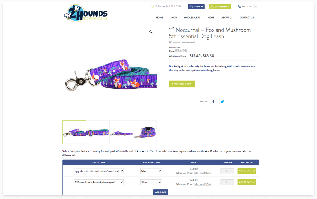
Thinking about streamlining the buying process for wholesale customers, we incorporate a custom method where it is possible to choose the same product model combining different characteristics such as size, color, design and quantity in a friendly in-line table. Users can view their items in a list within the product page, which facilitates large purchases.
Blog
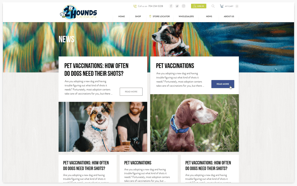
An ideal space to connect with the audience by sharing informative articles. With a simple and friendly format, the 2HoundsDesign Blog manages to capture interest from the first moment, providing valuable material for those who visit it.

By redesigning the store, we made it easier for customers to navigate while adding items to the cart. The filter columns and the tab to sort the search results, allow to reach specific products in less time, thus simplifying the choice of characteristics in a collar or harness.

With detailed descriptions and clear images that zoom in on the slide, we get a perfect product page to show the detail of all the items. Users who want to access the reviews or know the instructions for use, can do so by pressing any of the buttons below.
Additionally, you will find customization options for your purchase by choosing the size of the harness and the complementary product suggested by the system.

Thinking about streamlining the buying process for wholesale customers, we incorporate a custom method where it is possible to choose the same product model combining different characteristics such as size, color, design and quantity in a friendly in-line table. Users can view their items in a list within the product page, which facilitates large purchases.

An ideal space to connect with the audience by sharing informative articles. With a simple and friendly format, the 2HoundsDesign Blog manages to capture interest from the first moment, providing valuable material for those who visit it.
