Are you looking to improve your website conversions? Of course you are, and an effective call to action (CTA) strategy can help you with this goal. Use these helpful tips for creating more compelling CTAs, and start getting more conversions today.
 Choose Your Call to Action Phrases Wisely
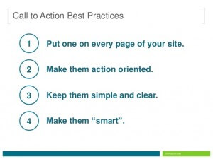
When creating a CTA, it is important to use descriptive and active phrases in order to create the sense of positive action.
Avoid using a CTA like “Click Here”, an instead, choose phrases including “Learn More”, “Download Now”, and “Get Started.” These positive actions will help your visitors to move down the right path.
Make Sure that Your Call to Action is Clear
When creating your CTA, it is important to consider what it is you want your visitors to do on each page. To make your actions clear, give your visitors a clear set of directions.
Don’t be vague, and at the same time, make sure that you aren’t being too wordy with your CTA. Use succinct wording including clear, short verbs, and ensure that your tone is confident without being pushy.
 Give Your Visitors a Good Reason to Act
Even the strongest call to action won’t perform well if the rest of your page content doesn’t speak to your visitors.
Make sure that your customers fully understand why it is so important that they respond to your CTA, and use your copy to focus on the benefits to your visitors. You also need to set your visitors’ expectations, as well, as your visitors will need to understand what they’ll get when they click on the call to action to move on to the next step.
Ensure Good Visibility with Your Call to Action
While this might be an obvious tip, it isn’t uncommon to visit a website where the CTA is nonexistent or simply isn’t visible right away. Consider how visible your CTA action is on your website by asking yourself a few questions:
- Is your CTA buried among a lot of other graphics or text?
- Is your CTA shoved into a remote corner of the page that can only be reached with excessive scrolling?
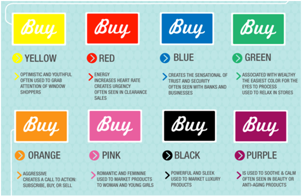
- Is the font of the CTA too small, or does the background color prevent it from jumping out from the rest of the page?
- Keep Your Call to Action Design Strategy Consistent
If you have multiple CTAs throughout your website, take care to make them consistent and easily recognizable. By changing from links to buttons throughout your site, you can create confusion. Drastic changes in shapes and colors will have the same effect, so help your visitors to identify CTAs with consistency. Our Internet marketing specialist can help you create a consistent CTA design that will be sure to get noticed by your visitors.
 Put a Call to Action on Each Page
After your visitors skim a page on your site, they’ll need to decide what to do next. By placing a prominent CTA on each page, you’ll ensure that they head in the right direction.
You should also remember that visitors aren’t always going to enter your site from the main page, and placing a CTA on each page can be crucial to getting them to act.
Conclusion
Optimizing your call to action is just one step in helping you to generate more leads for your website. Take advantage of our internet marketing services to improve your conversion rates and get more business.
Cultura Interactive is an award-winning, Fort Lauderdale web design agency that strives to create unique and attractive websites, and help businesses improve their internet marketing strategies to boost conversions.
Our team of professionals specialize in website design, logo design, WordPress development, e-commerce, responsive web design, mobile apps, SEO, social media management pay per click advertising and more. Learn more about our services or contact us for a personal interview.


