With the subscriptions business undergoing several upheavals in the past few years, it’s a matter of making sure that how you do it is completely optimal.
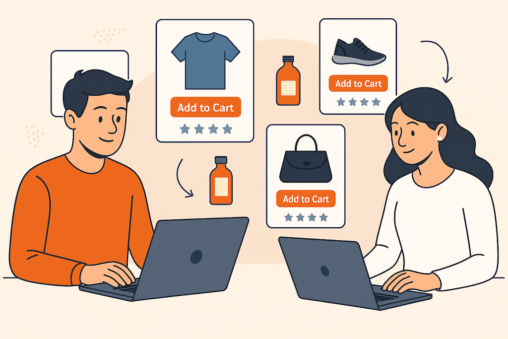
User experience is a key ingredient for better conversion. Each element, however seemingly minor, plays a role in making or breaking a sales journey and therefore affecting conversion. According to user experience consulting firm Nielsen Norman Group, a well-designed interface of an eCommerce business can help increase conversion rate by up to 83%.
Following are 10 UX mistakes that you may be doing and what you can do instead:
Too many steps in the signup and checkout process
There is no absolute formula that identifies the exact steps each customer wants for convenient shopping. What is clear, however, is reducing the steps (such as clicks or signing up) for users to sign up or check out a product. The more actions required from the customer, the more likely they abandon the whole process. Research shows that over half of users will abandon their agenda on your site if they need to register. Requiring signup disrupts the user experience and adds a step to the whole process. More often than not, users would simply decide not to pursue the transaction.
 In addition, studies show that 82% of people forget their passwords, and 75% of those who recover their passwords won’t even complete the checkout process. This number is significant in a space where there are many choices—like eCommerce. Simply put, providing the option for guest checkout can boost usage, and studies show that this increase can be between 30 to 40%.
Make your process the most optimal by giving priority to the most important steps to complete subscriptions signup or to check out a product in your eCommerce store. Adding certain elements to manage expectations can also help users become more patient—for example, a progress bar that lets them know how many more steps they need to do before completion.
Help is not available
Customers will almost always have more questions. If you aren’t available to answer them, they’ll look for answers elsewhere… usually to your competitor.
Having a live chat or a hotline option helps guarantee that someone is available to help for any and all questions they may have regarding your business, subscriptions offers, or how it fits their current needs. Making yourself available at their disposal can help seal the deal and even nudge them towards subscribing when their hesitations are addressed.
Unresponsive design
Failure to consider that some people browse online through different devices can lose good business from even well-known companies. Better conversion for your subscriptions includes how good the experience is for users to navigate your site, educate themselves, and transact with your business. If your page doesn’t load for some devices or has a bad user interface for some models, then it will immediately drive your customers away.
Prioritizing the responsiveness of your website is just as important as the actual process of your sales journey.
No clear messaging or selling point
Before users choose you, they should first find a reason why they should even consider you. If your message is all over the place or you fail to deliver a key selling point of your subscription model that sets you apart from your competitors, you create an immediate disconnect with your target market. Their experience as users doesn’t stop at the technical process of choosing a subscription plan to send their payment. It heavily involves how you communicate so they have a clear understanding of what you want to say and what you want them to do.
Low quality or unoriginal images
Images within a page help content become more visually appealing by giving supplementary contexts or by simply breaking the monotony of texts. However, the type of images you choose can also affect the overall design and impact of your pages.
Original, high-quality photos draw more visitors as they give a sense of authenticity compared to stock images that sometimes look posed or are overused on many other websites. The generic feel of these ready-made photos and videos may make your visitors feel like you don’t give enough effort to give them an authentic image.

Call-to-Action (CTA) buttons are hard to see, read, or click
Where your call-to-action is located greatly influences your customers’ user experience. The goal of many pages is to sell—whether that’s a product, subscriptions, or signup to a webinar. CTAs and their placement are integral to conversion. CTAs that are hard to see because of how the page is laid out don’t solicit an action from a visitor. For instance, if it takes three scrolls down your page to find the first call-to-action button, you already lose your chance to convert users when they don’t scroll down the page at all. Your above-the-fold content and design are important, but it only really matters if there’s a clear action you want the customer to do.
The CTA copy is also a vital element that influences conversion. “Subscribe now for a free trial” will be much more effective in getting your customer’s foot in the door compared to “Sign up now.” The former immediately sets expectations regarding costs—one of the common barriers in subscriptions businesses, while the latter only calls for action with no compelling carrot.
Content is not skimming friendly
Well-optimized content may help you get into rankings, but the reality is, not all users read all of your copy on your site. People have short attention spans and usually just skim content. If they have a hard time doing so, or simply find walls of text on your page with no images or care for formatting, then it’s likely they won’t even bother comprehending what you have to offer.
Using white or negative space helps you improve a user’s reception of your page’s content. In subscriptions, this means that the formatting of your offers must be easy to digest—such as use of icons, bullets, tables, focusing on the brevity of content, and so on. Doing so optimizes your content’s visibility and improves the user experience.
Distracting animations and transitions
Animation can draw a user’s attention and control where they focus but it can also become a distraction if done poorly. When elements change their position or how they look, it can tell a narrative but may also potentially ruin your messaging. Disruptive movements in your animation and transition may make your user distracted from signing up for your subscriptions offers and refocusing their attention elsewhere.
The key to using animation and transition for better conversion is to time them well and only use effective, non-disruptive methods that contribute to what you want to say.

Unorganized navigation or sitemap
Your website may stand out among thousands of other merchants with the same offerings. However, you may lose potential clients if your site is difficult to navigate. If your visitor is unable to locate your offers, pricing, or a comparison page for your different subscriptions, they may be inclined to simply leave your site.
To improve your subscription’s conversion rate, think of what your customers would look for on your site frequently and make them visible on your website with the least amount of effort from visitors.
The process is too manual
There are many ways to simplify the user experience, so a manual process that doesn’t lend a hand to menial tasks may be seen as an excuse not to sign up.
Your site should be able to autocomplete or provide search suggestion functionality to help users find what they need with minimal time and keystrokes to execute. The instant feedback by autocompleting can help improve overall UX, leading users to find what they need faster.
This also applies to manual methods like sending a photo of the deposit slip instead of a payment channel that allows immediate payment and real-time recording with only a few clicks.
What you can do next to improve conversion for your subscriptions model
There are many eCommerce subscription platforms you can use and even plugins you can add to your tool belt. But the most effective way to ensure that you don’t lose out on potential customers is having an eCommerce solution created from scratch made exactly to the specifications of how your business operates and how your customers behave. The whole process of optimizing your business is made simple by WooCommerce Subscriptions—an easy solution to even the most complex eCommerce challenges with the flexibility to adapt to the needs of different businesses.
Whether you have a new business or already have an existing eCommerce platform, migrating to WooCommerce is convenient. Our team of experts can help you transition your whole operations and optimize your subscription model without disrupting your business and losing any renewal in the process. Discuss your concerns and goals with our skilled experts for free to help you determine the best next step for your business.