Homepage
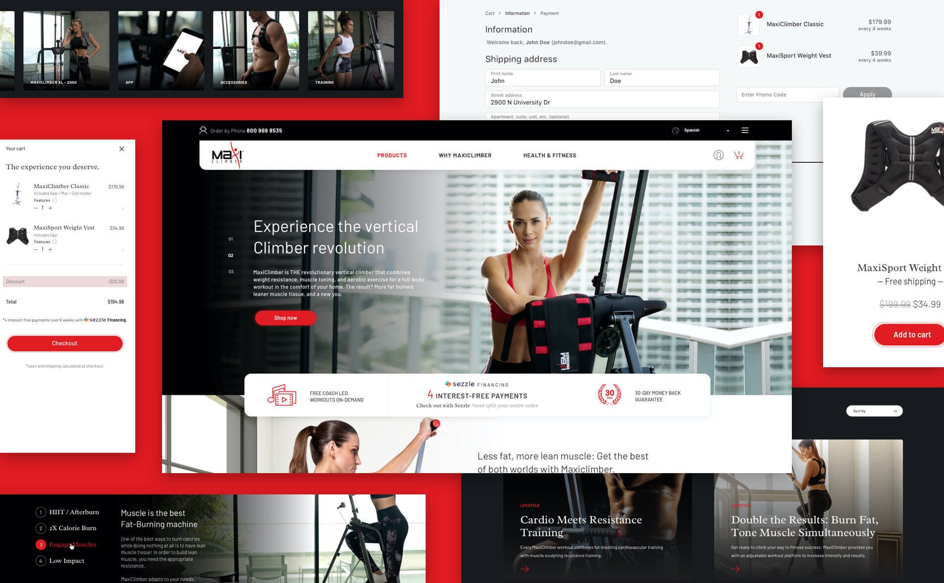
The main page had to stand up and impact to attract visitors. We included a video with a real life scene showing how the machine performs. From the initial landing page, users have access to information about MaxiClimber products, as well as their benefits and uses. Calls to action are strategically located throughout the homepage to capture customer attention and persuade them to move forward with their purchase or take advantage of the health and fitness tips.

Reviews
The new website incorporates an online store created with a custom theme for WooCommerce. Customers can purchase the ice creams by selecting from the available options and changing aspects such as size and flavor according to their preferences. The dropdown tab features a description of the ingredients along with nutritional information for the product.
When confirming the purchase, the system automatically calculates the delivery date, being possible to ship it to almost anywhere in the United States.
Shop
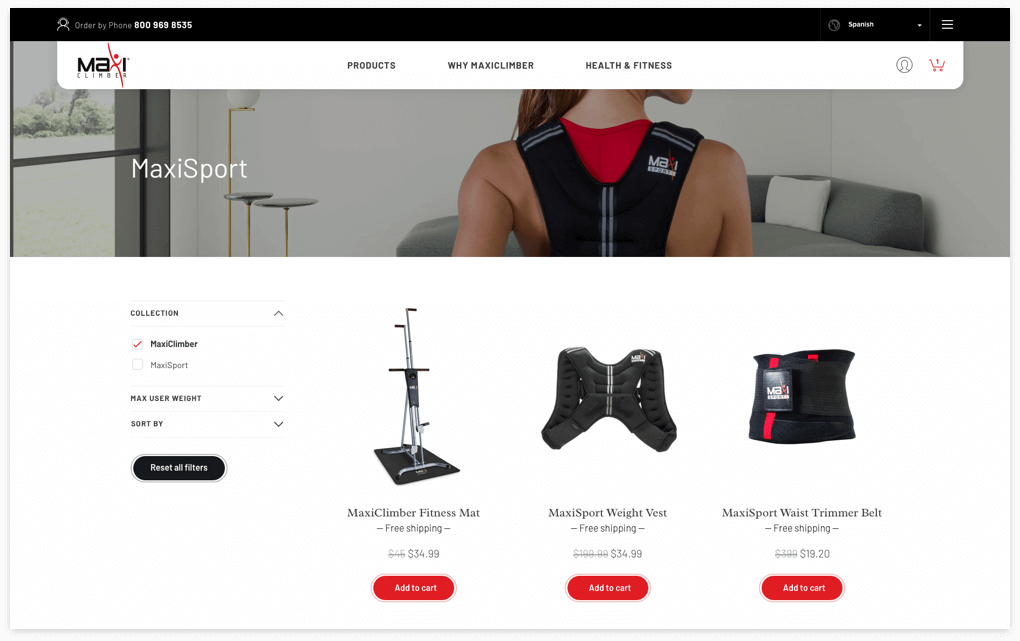
A direct access to the Shop allow users to enter the main products page or browse the accessories i the catalog. Each product is accompanied by sections for reviews, ratings, and specifications as well as an offer of related products.
Blog
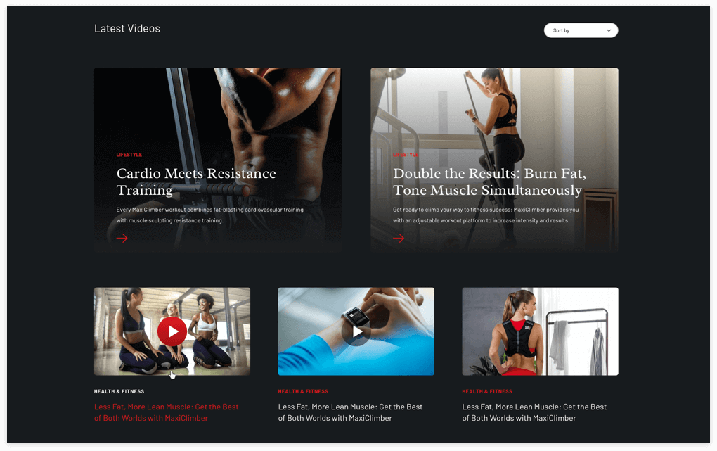
One of the best parts of transforming the MaxiClimber website was creating a Blog. Any visitor interested in learning more about the benefits and attributes of their line of products can find valuable information by browsing through the different categories and articles. From beginner’s guides to exercise ideas and techniques, the Health & Fitness section has what it takes to provide additional support for the most frequently asked questions.

The new website incorporates an online store created with a custom theme for WooCommerce. Customers can purchase the ice creams by selecting from the available options and changing aspects such as size and flavor according to their preferences. The dropdown tab features a description of the ingredients along with nutritional information for the product.
When confirming the purchase, the system automatically calculates the delivery date, being possible to ship it to almost anywhere in the United States.

A direct access to the Shop allow users to enter the main products page or browse the accessories i the catalog. Each product is accompanied by sections for reviews, ratings, and specifications as well as an offer of related products.

One of the best parts of transforming the MaxiClimber website was creating a Blog. Any visitor interested in learning more about the benefits and attributes of their line of products can find valuable information by browsing through the different categories and articles. From beginner’s guides to exercise ideas and techniques, the Health & Fitness section has what it takes to provide additional support for the most frequently asked questions.
Purchase and Checkout
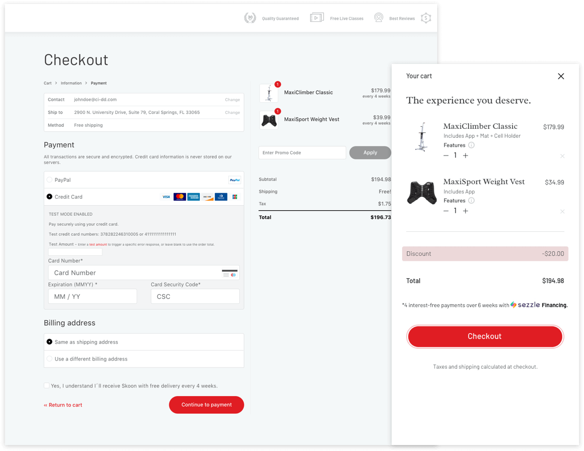
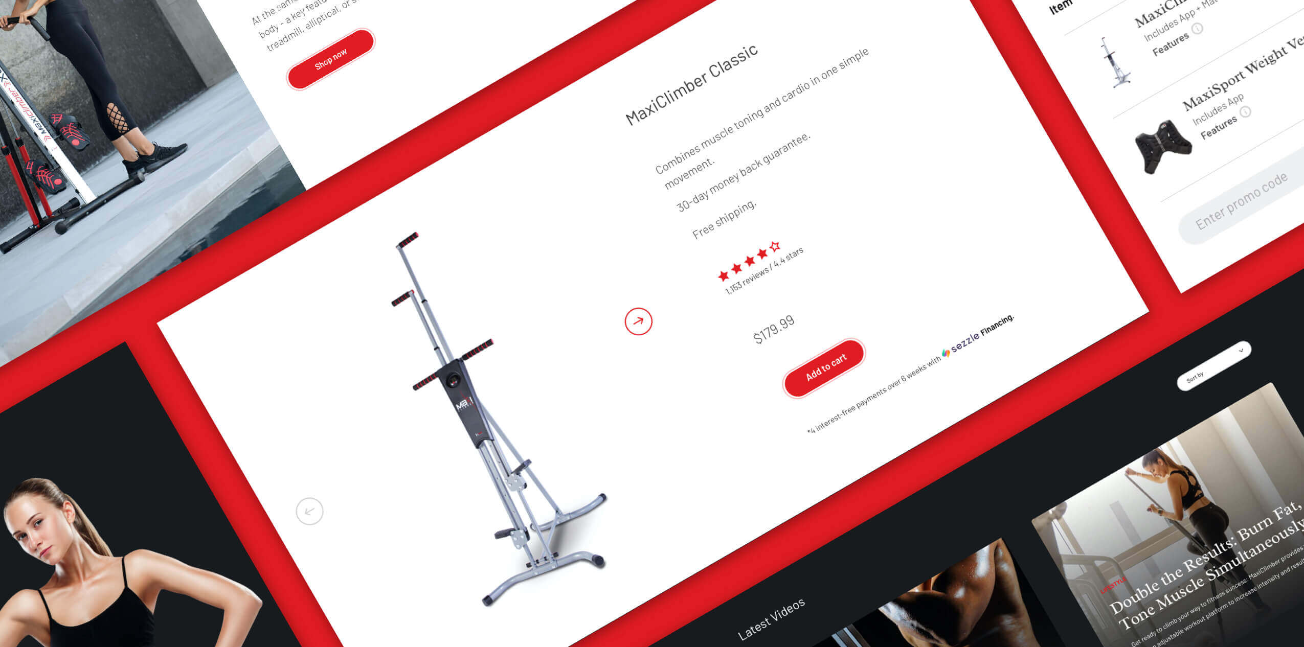
With the user interface optimized, we not only achieve a more intuitive and friendly website, but one that responds effectively to the needs of their visitors. Browsing and selecting products are now easier thanks to the integration of a mini-Cart, which allows to quickly view the selected products to add more or Checkout.
The final Checkout page provides auto-complete features as the customer enters their information. Email field heads the final step to allow the system to capture this important information in case of any disruption throughout the process, and it is followed by the shipping address (instead of the billing) to increase rate conversion. These combination of factors helps simplify the buying process.
