Homepage
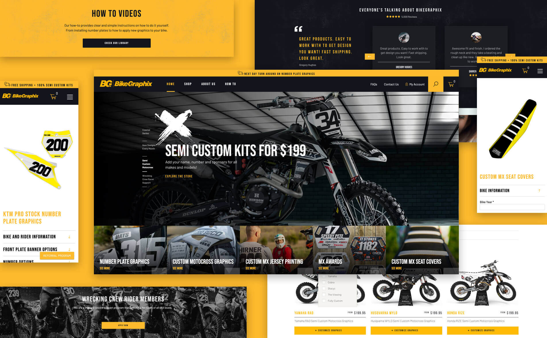
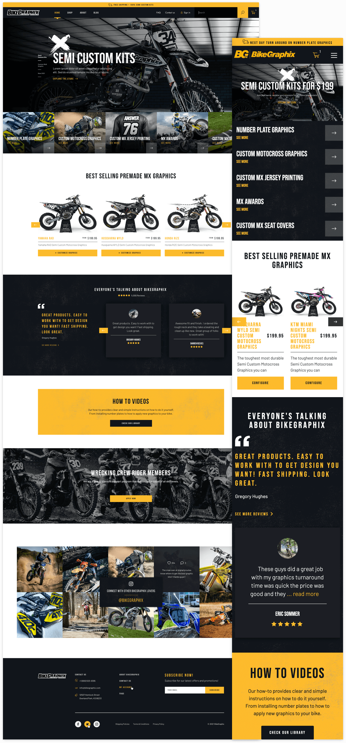
The main page has a dynamic design in which brand’s colors stand out. From the moment visitors arrive, they get a glimpse of the newly released products and additional services that BikeGraphix offers. The calls to action are present throughout the entire homepage, divided into sections that drive navigation to other areas of the website.
In addition to creating a section with the best sellers, we incorporated a section of reviews to provide confidence and social validation to potential buyers. Similarly, users can access “How To Videos” to see the available tutorials on how to apply decals on different parts of their motorcycles.
Shop
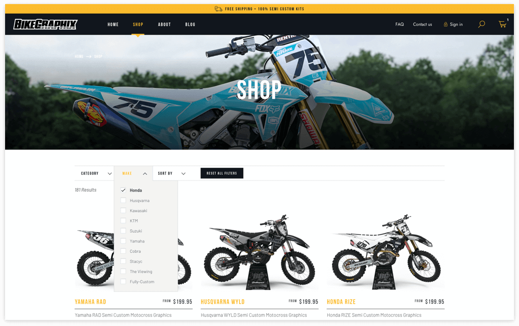
Although redesigning the store was quite a challenge, the results met our expectations! By displaying the “Shop” within a mega-menu, visitors can access to any of the sections specially created for each type of product or service. From pre-designed decals to custom graphics and accessories, the website offers a detailed view of available items.
The filter list located at the top of the store allows you to filter searches according to popularity, category, rating and price, facilitating navigation to find any product in less time.
Product Page
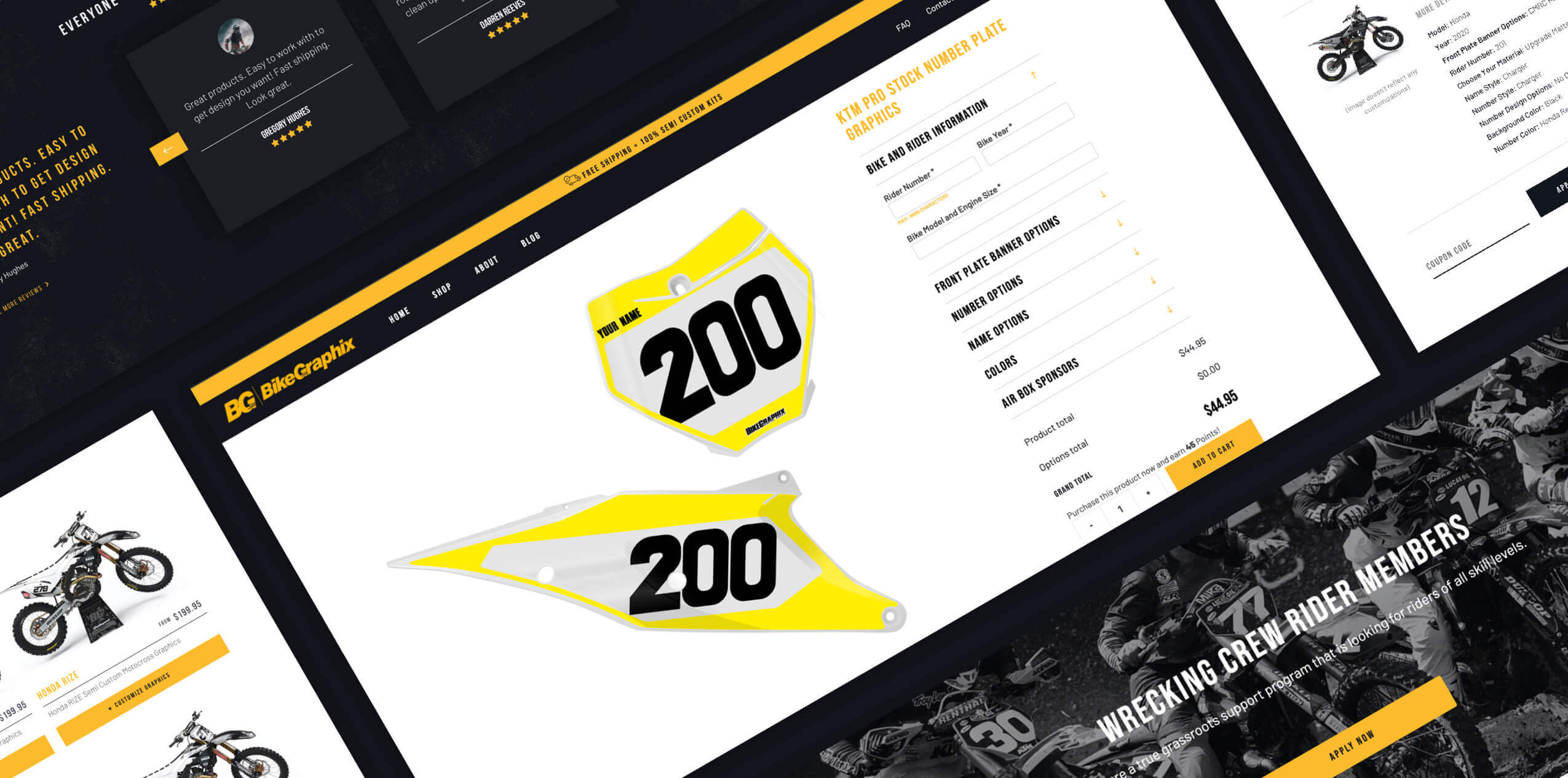
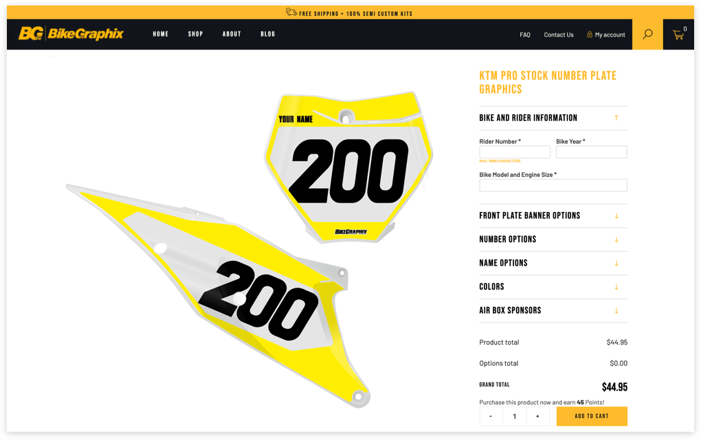
Another important change and a big UX challenge that we implemented in the new website was the redesigning of the products. Each product have options to be customized with a wide selection of elements that customers can choose at the time of purchase. Options appear in a accordion panel and may include: Bike and rider information, number options, name options, color, air box sponsors, etc. By choosing or filling in these fields, users obtain a design 100% adapted to their tastes or needs.
Wrecking Crew Rider Members
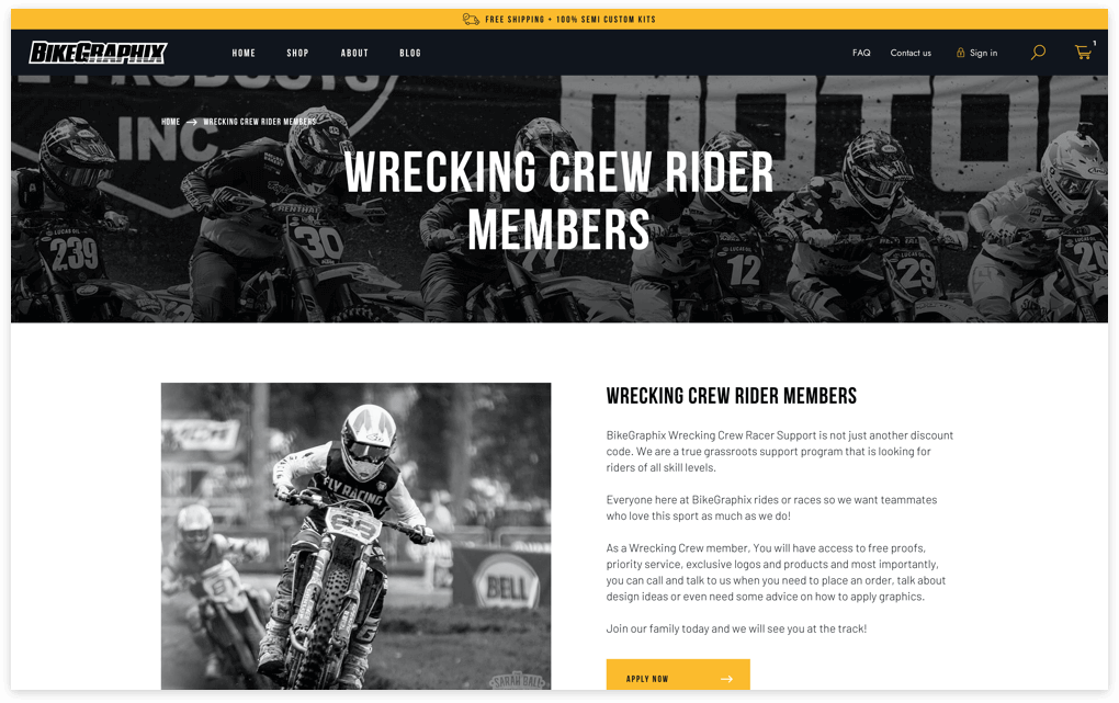
It is a program created to provide support to motorcyclists of all levels and from anywhere. BikeGraphix not only wanted to build a space where customers could get benefits and discounts, but also wanted to bring together its own community of fans.

Although redesigning the store was quite a challenge, the results met our expectations! By displaying the “Shop” within a mega-menu, visitors can access to any of the sections specially created for each type of product or service. From pre-designed decals to custom graphics and accessories, the website offers a detailed view of available items.
The filter list located at the top of the store allows you to filter searches according to popularity, category, rating and price, facilitating navigation to find any product in less time.

Another important change and a big UX challenge that we implemented in the new website was the redesigning of the products. Each product have options to be customized with a wide selection of elements that customers can choose at the time of purchase. Options appear in a accordion panel and may include: Bike and rider information, number options, name options, color, air box sponsors, etc. By choosing or filling in these fields, users obtain a design 100% adapted to their tastes or needs.

It is a program created to provide support to motorcyclists of all levels and from anywhere. BikeGraphix not only wanted to build a space where customers could get benefits and discounts, but also wanted to bring together its own community of fans.
