Checkout optimization is vital for companies selling online. The cumbersome user experience in the WooCommerce Checkout procedure can be highly improved. Here’s how we did that successfully for a client.
Recent checkout optimization research reveals that 26% of users have abandoned the checkout process because the checkout flow was too long or too complex. For a company selling $10,000 worth of goods online a month, that equates to a recoverable loss of $3,513 a month or $42,156 per year. The WooCommerce checkout process is particularly cumbersome, despite the many other reasons we recommend that companies stick with WooCommerce for their online stores.
WooCommerce is, in our opinion, the best choice for any company wanting to sell online. It’s free, highly customizable, open-source, and you get to keep 100% of the profits you make instead of having to pay a cut to a service provider like Shopify.
In this article, we’re going to take a look at checkout optimization from a WooCommerce perspective, and talk in detail about the changes we made to the WooCommerce checkout process for a client of ours.
But first—understanding checkout abandonment versus cart abandonment
A very quick note: It’s important to understand checkout abandonment versus cart abandonment. Checkout abandonment is when the user has already initiated the payment process. Cart abandonment is when the user is still browsing.
The mindset of a user at the cart phase versus checkout phase is usually quite different. Cart abandonment statistics are staggeringly high, as much as 96% in the automotive industry and nearly 95% in the Baby & Child sector. A large reason for this is that many users in the cart phase are still shopping around, saving items for later.
The most immediate gains can be gotten from optimizing the checkout process first because a user in that phase is usually ready to buy.
Problems with the WooCommerce checkout process
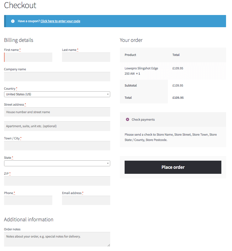 The WooCommerce checkout feels too busy and has too many fields. A regular WooCommerce checkout page has 18 fields. Baynard’s checkout optimization research found that the average number of fields on a checkout page is currently 12.8, but that successful guest checkouts can be achieved with as little as 6 – 8 fields.
Too many fields can make the checkout process overly complicated, so can fields positioned in the wrong place. Confusions between shipping address and billing address are also factors that might lead to checkout abandonment.
Specifically, we isolated the following six problems with the WooCommerce checkout:
- Coupon code at the beginning of the process
- Email field buried at the end of the billing information
- Asks for billing information first
- No auto-complete for addresses
- Primitive field validation messages
- Error messages that don’t indicate where the error exists.
Let’s look at these points in detail:
Coupon code field at the top
Placing a coupon code at the start of the checkout procedure may cause some users to abandon the checkout process while they go off hunting for codes on Internet. Even when a coupon can influence shoppers for taking advantage of some savings, ideally coupon fields should come at the end of the form or in a later step of the checkout process, but definitely after you have obtained the user’s email address.
Once you have a user’s email address, you can always send them an email later to get them back to your store. And you can even offer them a coupon in that recovery email.
Email field
WooCommerce tends to confuse some buyers by providing two buttons at the start of the checkout process—the coupon button, and a “Login” button.
There are two problems with this:
- Getting users to make another decision so early in the process can bring about uncertainty. Users should be guided smoothly through the checkout without the need to make any further decisions unless completely necessary.
- Forcing users to create an account causes up to 24% of them to abandon the checkout process.
Billing address versus shipping address—a common confusion
Many customers, particularly in B2C sales, can find the concept of a billing address frustrating. In the vast majority of B2C sales, billing and shipping address is always the same.
Autocompleting addresses
Providing an autocomplete function via a mapping API can highly reduce checkout abandonment.
Keep in mind that 27% of purchase’s process are abandoned because the checkout page is too slow and generates frustration. Google recommends and have slowly implemented in their Chrome browser auto-filled forms features which can increase form’s filling up 30 times faster.
How we solved these WooCommerce checkout problems for a client
Our client MaxiClimber, required a redesigning of their website together with a new platform in WooCommerce that allow them to easily manage marketing campaigns and offer all the bells and whistles of a modern e-commerce system.
MaxiClimber’s products are top-of-the-range, meaning that the checkout process needed to be super-slick, especially considering the indecisiveness of the 25-34-year-old cohort which can lead to checkout abandonment.
We customized MaxiClimber’s WooCommerce checkout to encompass the following improvements:
Initial buttons and email address
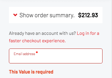
We removed the coupon and login buttons the user is first confronted with, and replaced them with an email input box. This allows us to capture the email address immediately, opening the door to recovery of the sale afterward through follow-up emails if necessary. Users with an account can click the discreet link above the email box for a faster checkout.

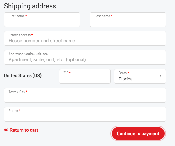
Billing information improvement – Shipping First
Instead of showing the user the billing address, we first show them the shipping address fields. Later in the checkout process, if there is a discrepancy in addresses when compared to the credit card, we offer the option to add a billing address.
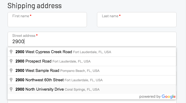
Autocomplete Address
All address fields contain the respective HTML5 tags for auto-complete so that the user’s browser can fill in the information for them if it exists. Additionally, we have programmed an autocomplete function utilizing Google Maps API calls, to make it easier to fill in shipping addresses for the user improving speed and accuracy.
Intuitive and friendly field validation
One of the most user experience (UX) issues from WooCommerce is the manage of field validations. They are listed on the top of the page and shoppers are not shown where they missed a field to proceed with their purchase. We added a smooth field validation code that triggers error messages in specific fields that were missed. The error messages are clear and easy to understand.

Coupon code field
Finally, we’ve moved the coupon code on desktop screens to a more intuitive location, not mixed in with the shipping details but connected to the payment details.
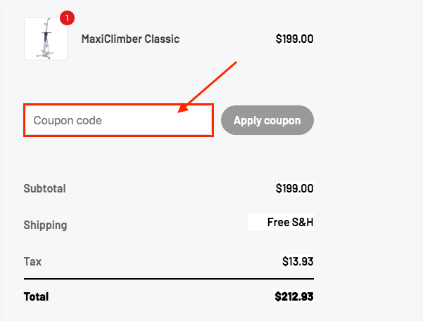
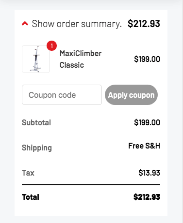
On mobile devices, the coupon code field is not visible unless users click the dropdown arrow on the left to view the order once again. This was made to keep a clean user experience when allowing the user to maintain at hand detailed information about the transaction.
Why we will always love WooCommerce
WooCommerce is an extremely flexible e-commerce tool that offers a plethora of options and flexibility compared to proprietary solutions. The fact that it is also open-source means that WooCommerce specialists can modify anything that isn’t perfect and so tweak the plugin to everybody’s needs.
By customizing the checkout process, WooCommerce can be brought up to par with proprietary giants such as Shopify and BigCommerce, and even made better than these competitors.
Cultura Interactive agency is an award-winning Fort Lauderdale Website Design Studio that strives to create unique and attractive websites, and develop strategic digital online marketing campaigns for our clients.
Our team of professionals specialize in custom WooCommerce development, E-commerce Subscription websites, WooCommerce Membership, E-commerce automation and more. Learn more about our services or contact us for a personal interview.

